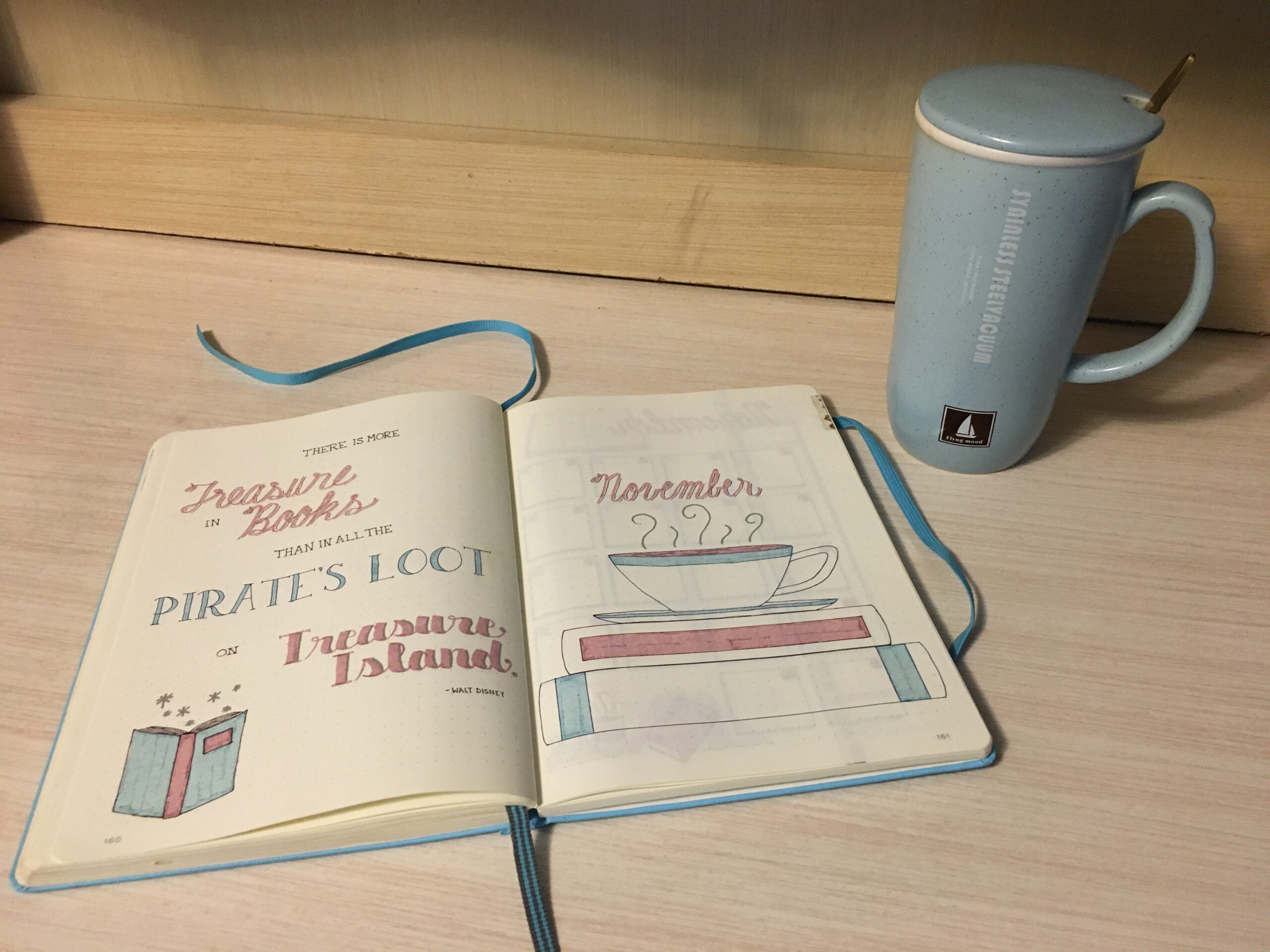
November Bullet Journal: Books & Coffee with Dutch Door Layout
In this particular journal, I’ve been making a point to experiment with my layouts. I’ve made my calendar spreads larger than usual, I’ve changed up my daily layouts from month to month, and I even turned an entire month sideways. So, in keeping with that goal, I decided to try something this month that is very different from anything I’ve ever done before. Namely, a Dutch door layout that involves cutting some of the pages.
The theme I chose, books and coffee, is not at all new for me. I’ve used different variations of it several times before (and I’m sure I will again). In fact, I almost passed it up, because I did an old-books-inspired theme last March. But it went so well with the color scheme I wanted and everything just sort of came together.
As I was browsing Pinterest for inspiration, I came across a few Dutch door ideas. Drawing from those, I eventually came up with this layout, which I like more than I expected to.
November Bullet Journal Quote & Title Pages
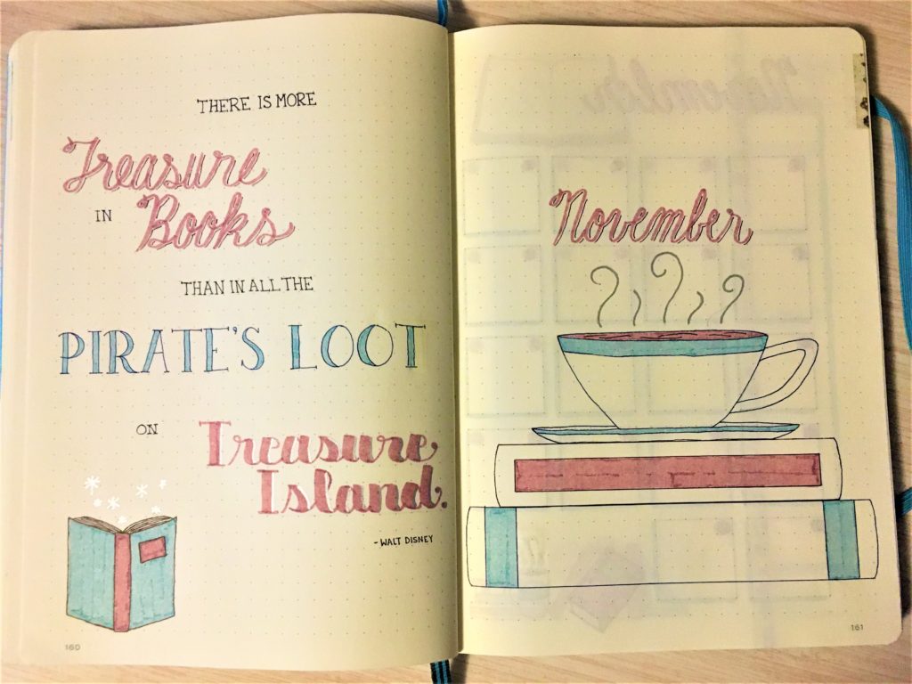
This month’s quote almost chose itself, since it ties together the monthly theme and the overall treasure/adventure theme:
There is more treasure in books than in all the pirate’s loot on Treasure Island.
Walt Disney
I first ran across this quote a few months ago, and actually considered using it for my August pirate theme. So I made a little callback to that August theme with the lettering for the words “Treasure Island.” I wrote them in the same font and color that I used for my August headings, though I switched out the gold accents for silver, since it blends better with the brown and blue I’m using for November.
November Bullet Journal Monthly Spread With Dutch Door
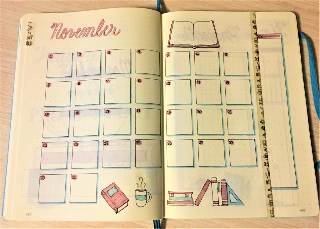
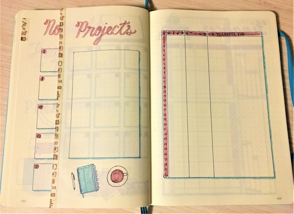
As I mentioned above, I wasn’t 100% sure I would like this Dutch door layout. But the more I thought about it and sketched out what it might look like, the more I did like it.
Since I had extra space on the far right page, I decided to add in a gratitude list. (It is November, after all!) So as I fill in my daily habits and mood trackers, I’ll also be adding one or two things that I’m thankful for each day.
November Bullet Journal Finance Pages
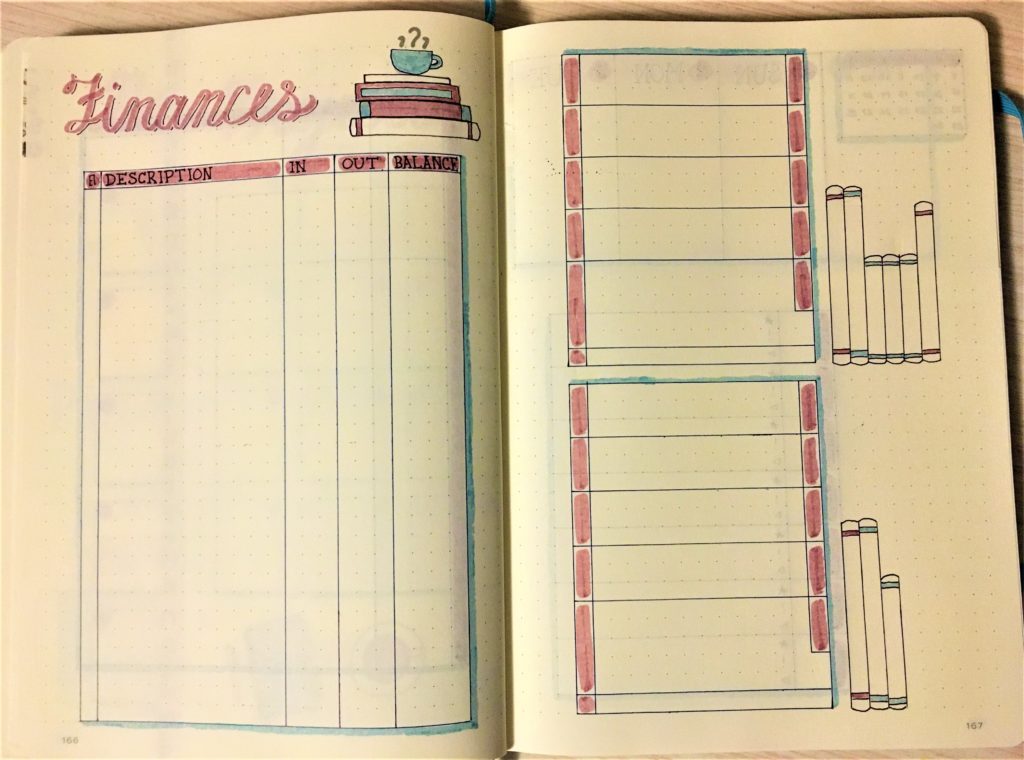
As usual, these pages are pretty much the same. I’m sure in the next journal I’ll change them up again, but it has been nice not to have to decide a slightly different layout for these spreads each month.
Weekly Spread with Dutch Door
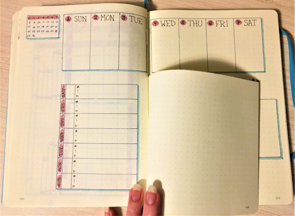
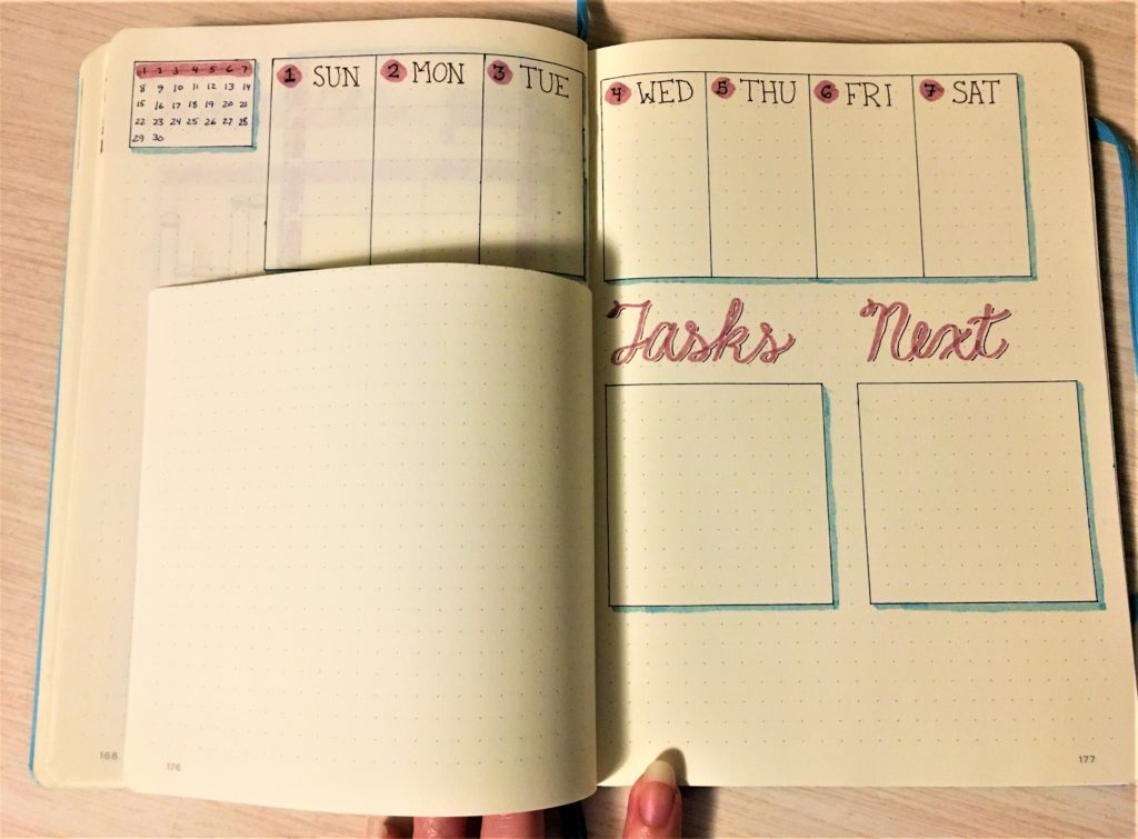
I don’t usually include my weekly layouts in these posts, because I don’t tend to draw them out ahead of time. But since November starts on a full week, and since I’m doing something so different, I thought it was a good opportunity to go ahead and get the first week set up now.
I like to set up my new daily page each morning, because it helps me get ready and focused for the day. And I also like to see the full week at a glance for planning purposes. So I knew I would have to keep both of those things for this setup to work.
What I landed on was putting a weekly schedule across the top, with the Dutch door effect for the daily pages. Normally, I designate roughly half a page for each daily entry, though the actual amount of space I end up using varies. This time, I cut the tops off the pages about one-third of the way down, so each daily page gets two-thirds of a normal page size.
I don’t foresee myself using this setup permanently, but I think it will be fun to try it out for now.
What do you have planned for November? Are you trying something new, or sticking with something comfortable (or a little of both)? I’d love to hear from you.

